
Your vehicle wrap is a moving billboard, but is it really working?
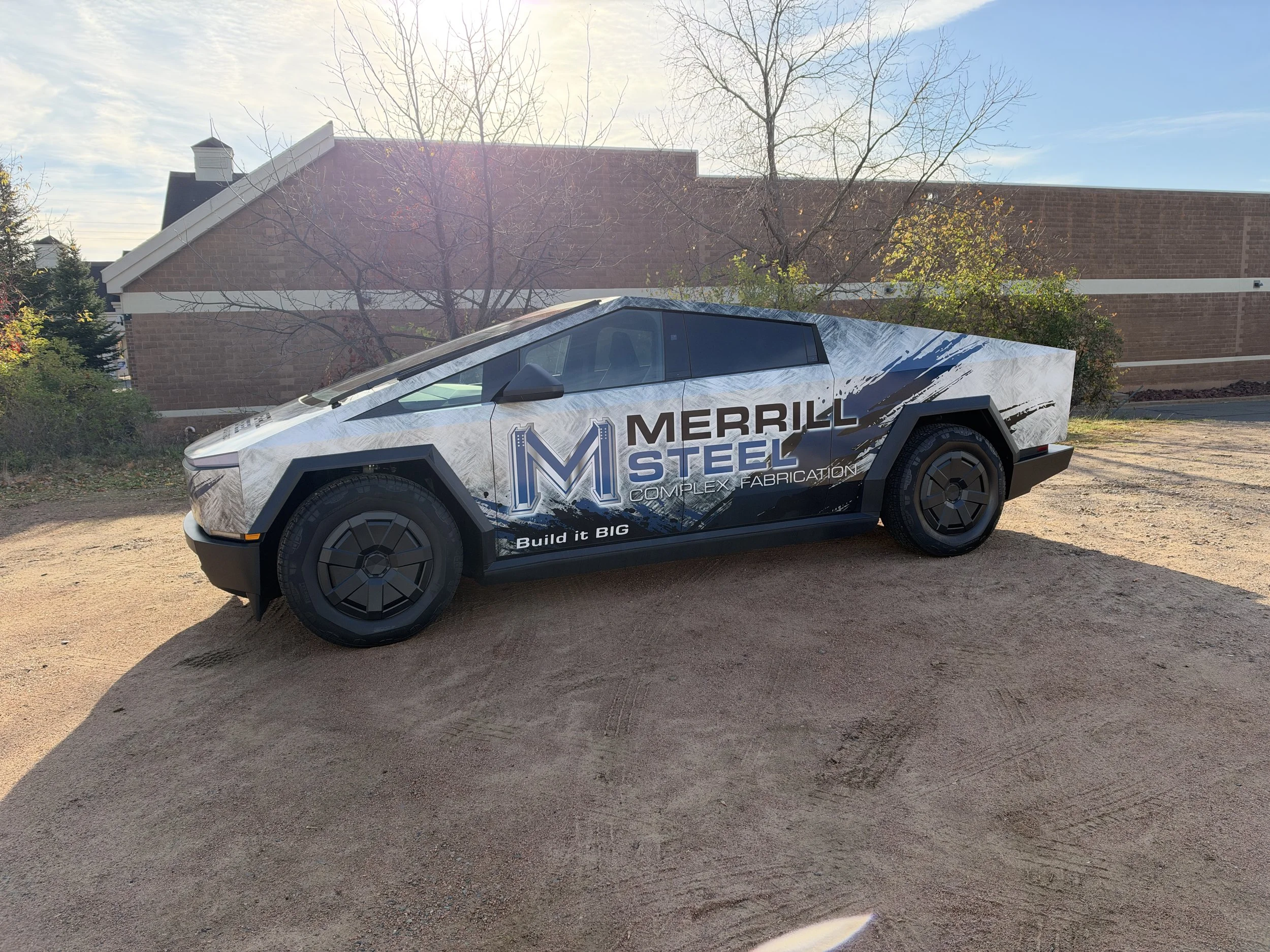
A great vehicle wrap does more than turn heads. It communicates your brand, builds recognition, and makes your business memorable. But when it comes to vehicle wrap advertising, good design isn't just about looking good. It's about being effective. Think about the last wrapped vehicle you saw driving down the road. Do you remember the company name? What they did? How to contact them? Or do you just remember seeing a really colorful truck? There's a big difference between a vehicle wrap that gets attention and one that actually works as advertising. At FlipSide Graphics, we believe wraps should be an effective advertising tool. Whether you're wrapping one work truck or an entire fleet, the goal is the same: get your message across quickly, clearly, and professionally.
Here's what makes a vehicle wrap an effective marketing tool.
1. Readability: If They Can't Read It, It Isn't Working
One of the biggest mistakes in vehicle wrap design is trying to include too much information. Your vehicle isn't a brochure. It's a moving advertisement, and most people only have a few seconds to take in what they're seeing. If your message is buried under tiny lettering, complicated graphics, or a laundry list of services, you're missing an opportunity.
A successful vehicle wrap should communicate three things:
Who you are: Your business name and logo.
What you do: A clear description of your primary service or industry.
How to find you: A website, phone number, or another easy way to connect.
That's it. You don't need to list every service you offer or every certification you've earned. The easier your message is to understand, the more likely someone is to remember it. Our design philosophy: If someone can't understand what your business does in a few seconds, the design needs another look.
2. Design Concept: Start With a Strategy, Not Just a Cool Graphic
A vehicle wrap shouldn't be designed simply to fill every inch of space. Before we start designing, we want to understand your business. Who are your customers? What services are you trying to promote? What makes your company different? Where will your vehicles be seen? A plumbing company, a landscaping business, and a regional delivery fleet all have different advertising needs. Their vehicle graphics should reflect that.
An effective design concept considers:
Brand identity: Your wrap should look and feel like your business, using consistent colors, typography, and branding.
Target audience: The design should appeal to the customers you want to attract.
Brand recognition: Customers should be able to recognize your company across your vehicles, website, signage, and other marketing materials.
Visual impact: The design needs to stand out without overwhelming the message.
Sometimes a bold, simple design makes a bigger impact than a full wrap filled with elaborate graphics. And sometimes a creative, attention-grabbing concept is exactly what a brand needs. The key is knowing the difference.
3. Layout Matters: Every Vehicle Is a Different Canvas
One of the most important parts of vehicle wrap design is understanding the vehicle itself. Unlike a flat billboard, a vehicle has curves, body lines, door handles, windows, wheel wells, and other obstacles. These elements can either complement a design or completely disrupt it. We've all seen vehicle graphics where a door handle cuts through a phone number, a wheel well swallows part of a logo, or an important message disappears when a sliding door opens. That's why layout isn't something that should be figured out at the last minute. At FlipSide Graphics, we design with the vehicle's shape and functionality in mind.
A few important considerations include:
Logo placement: Your logo should be visible, prominent, and positioned where it won't be interrupted by vehicle features.
Text hierarchy: The most important information should be the easiest to see.
Visual flow: Graphics and lettering should naturally guide the viewer's eye through the message.
Viewing angles: The sides, rear, and front of a vehicle serve different advertising purposes.
Real-world use: Doors open, vehicles get parked, and graphics are viewed from different distances.
The rear of a vehicle, for example, is prime advertising space when someone is stopped behind you in traffic. That might be the perfect place for a website or phone number. The sides often need to communicate your brand quickly as your vehicle moves through traffic. A smart layout takes all of that into consideration.
4. Typography: The Right Font Makes a Difference
That fancy script font might look great on your computer screen, but can someone read it when your truck drives by at 45 mph? Typography is one of the most overlooked elements of vehicle wrap advertising. Font choice, size, spacing, and contrast all affect readability. Decorative lettering, thin fonts, and tightly spaced text can become difficult to read from a distance. And while using several different fonts might seem like a way to add interest, it often creates visual clutter. Our advice? Keep it simple. Choose fonts that reflect your brand while prioritizing legibility. Use size and weight to create hierarchy, and make sure your lettering contrasts with the background.
Your message shouldn't require someone to squint to figure it out.
5. Color and Contrast: Stand Out for the Right Reasons
Color is powerful. It creates emotion, builds brand recognition, and helps your vehicle stand out on the road. But more color doesn't necessarily mean better advertising. A wrap filled with bright colors, gradients, textures, and overlapping graphics can actually make your business name harder to see. The most effective designs use color intentionally. Contrast is especially important. Dark lettering on a dark background or light lettering on a busy photograph can become nearly impossible to read from a distance. Strong contrast helps important information stand out, while a consistent color palette reinforces your brand.
The goal isn't to use every color available. It's to use the right colors in the right places.
6. White Space Isn't Wasted Space
One of the biggest misconceptions about vehicle wraps is that every square inch needs to be covered with something. It doesn't. In fact, leaving intentional open space around your logo, message, or graphics can make the entire design stronger. Blank space gives your design room to breathe. It helps separate information, improves readability, and allows important elements to stand out. A clean, well-balanced partial wrap can sometimes be more effective than a busy full wrap.
It's not about how much vinyl you put on a vehicle. It's about how well you use the space.
7. Consistency Builds Brand Recognition
Your company vehicles are often some of the most visible representations of your business. Whether they're parked at a jobsite, traveling down the highway, or sitting in a customer's driveway, they're constantly putting your brand in front of people. That's why consistent branding matters. When your vehicles share the same colors, logo treatment, and overall design style, they become easier to recognize. For businesses with multiple vehicles, consistency also creates a more established, professional appearance. And that consistency should extend beyond your fleet.
Your vehicle graphics should connect visually with your business signage, website, employee apparel, and marketing materials. Every impression is an opportunity to reinforce your brand.
8. Design for the Real World, Not Just the Computer Screen
A vehicle wrap can look incredible on a digital mockup and still fall short once it's installed. Why? Because people don't experience vehicle advertising on a stationary computer screen. They see it at stoplights, in parking lots, on busy highways, and from across the street. They see it in bright sunlight, rain, and sometimes when the vehicle is covered in road grime. That's why we believe designs need to be evaluated beyond the screen.
Before approving a wrap, ask yourself:
Can I read the business name from a distance?
Can I immediately tell what this company does?
Is the most important information easy to find?
Does the design still make sense when viewed quickly?
Will the graphics work with the actual vehicle's shape?
If the answer to any of these questions is no, it's worth revisiting the design.
Your Vehicle Wrap Should Work as Hard as You Do
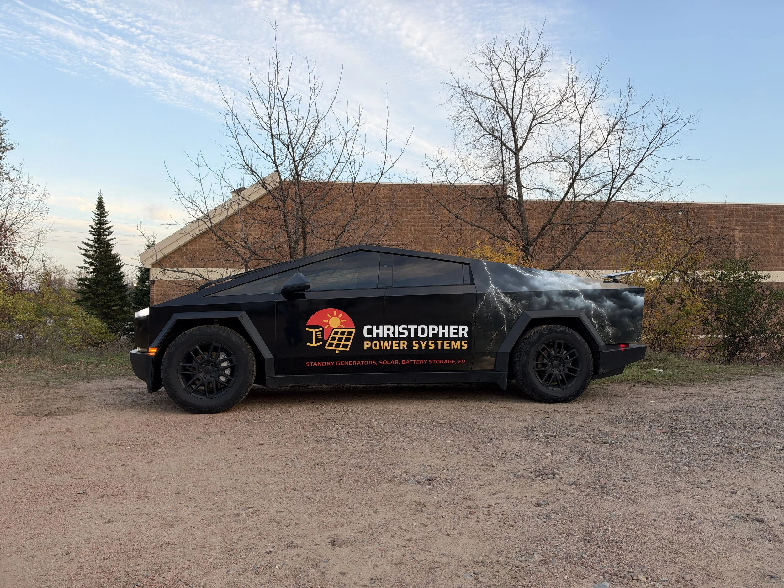
Vehicle wraps are a unique form of advertising because they turn something your business already uses into an opportunity to build brand awareness. Unlike advertising that depends on someone opening an email, clicking an ad, or picking up a brochure, your branded vehicle is out in the community doing its job while promoting your business. But visibility alone isn't enough.
A successful vehicle wrap combines strategy, creativity, readability, and thoughtful layout to deliver a message people can actually remember. At FlipSide Graphics, we're not interested in simply covering vehicles with vinyl. We want to create graphics that make sense for your business, represent your brand professionally, and help you stand out from the competition. From a single work truck to an entire commercial fleet, our team brings design experience, production knowledge, and installation expertise together to create vehicle graphics built for the real world.
